Last summer, I left Quebec City to settle closer to Montreal and I was so involved in my move that all my days were tinged with it for almost a full year. I excessively visited the classifieds sites to find THE most beautiful apartment, the one that would be perfect in my eyes. I made lots of boards of ideas on Pinterest , I walked around decoration stores with my head full of projects to decorate my apartment to my liking.
As I researched, I finally realized that the perfect apartments did exist, but they exceeded my budget by several hundred dollars. So I had to choose to have a less Instagrammable home, but much more adapted to my reality as a girl-who-leaves-school. So I found a charming place where I feel good, and to make it look like what I had imagined, I fell back on the decoration. I realized that having a contemporary-looking home only required a few key items, and that everything happened in the ornaments and the arrangement of my furniture.
Contemporary, modern, Scandinavian, minimalist?
I have absolutely nothing of an interior designer, and I find the term "contemporary" to be very broad, but if I rely on my own experience and my personal tastes, I have the impression that the homes which are popular at the moment are those with large open spaces, pale colors with touches of gray and black, lots of light, plants, and mixtures of textures.
I therefore propose the elements which, in my opinion, are essential to give a more modern look to your home.
Colors
Right now, white seems like a must to me. In addition to giving the illusion that the rooms are larger and more refined, white allows you to change your decoration according to the seasons, by adding items of different colors according to the occasions or your moods. Personally, when I arrived in my new place, I wanted all my furniture to be white, so I painted all the ones I already had, rather than buying new ones.
Since my walls, furniture and bed duvet are all white, I wanted to create a contrast by adding darker touches, for example with my curtains, my frames and my cushions , so I opted for gray and pink pastel. Moreover, my favorite decorative object is a small pink cactus, made of wood, which comes from the Abricotine company. I particularly like it because it's quirky, it adds a touch of color to my living room, it's reminiscent of the real cacti that are in my house, and it's understated.

Credit: Abricotine
The luminosity
This is not a scoop for anyone: natural light is always the most beautiful. The more a house has large windows, the more its luminosity is interesting. However, for those who live in basements or in places where windows are scarce, there are fortunately beautiful light fixtures to fill this lack of lighting.
Question of making the useful to the pleasant, choosing a fashion lamp can immediately make the room in which it is more modern. Whether it is a floor lamp, a wall lamp or a hanging lamp, there are several beautiful models selling in the local market. La Fabrique Déco also offers particularly attractive styles that can be adapted to any room in the house. In several models, wood and pale colors are in the spotlight, which goes hand in hand with the decorative elements of colors and textures.
Greenery
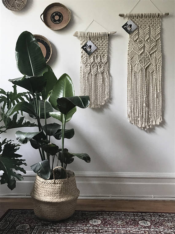
Plants are all the rage lately. Whether they are in mason jars, in flower pots, in terracotta pots or in planters, they always retain their charm. For my part, I have a particular affection for hanging planters , especially those in pastel colors, since they highlight the plant well and act as decoration. I also find that the indoor vegetable gardens are very beautiful.
Recently, I discovered theTête de courge company, and I literally fell in love with their products. Specializing in the development of indoor and outdoor vegetable gardens, they offer wooden structures that provide an optimal environment for plants, herbs and vegetables. For those who live in the city or live in small spaces, the company offers some really interesting alternatives.
Textures
To give more personality to its decoration, the mixture of textures is frankly effective. Wood, marble, macrame , brick, fabric, wallpaper, ceramics, metal, and so on; moderate use of each of them adds character to your home. No need to limit yourself to just one or two textures, you can let yourself go. I suggest having a main texture and only a few items inspired by other materials, in order to create a coherent whole.
For example, in my apartment, I favored wood and copper. Obviously, it's all a matter of taste and authenticity. If you want your house to look like you, it's just a matter of going there according to what inspires you… Because after all, you are the one who will live in your decor!

Reviewed by Maud Duchesne
Cover: Boho Montreal













Leave a comment
This site is protected by hCaptcha and the hCaptcha Privacy Policy and Terms of Service apply.